Concept Work
Different businesses need different websites.
These concept projects show how Saper can adapt its design approach to different sectors, customers and commercial goals.
Concept projects, not completed client work
01 • Trades and contractors
Northline Carpentry
Concept ProjectMake the service obvious in two seconds and put a quote request within thumb reach on every screen.
- Target customer
- Homeowners and small developers looking for a reliable contractor in north Dublin.
- Key conversion journey
- Service understanding, project gallery, areas covered, quote request
- Visual system
- Dark green and stone, heavy grotesque headings, high contrast blocks
- Selected components
- Sticky call and quote barProject gallery gridAreas served map listStep by step quote form
Design decisions
- Contact stays fixed on mobile because most enquiries come from a phone on site.
- Photography sits in large uncropped blocks so finished work carries the page.
- Type is set heavy and plain so the trade reads as capable rather than decorative.

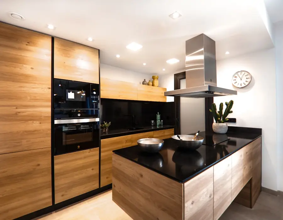
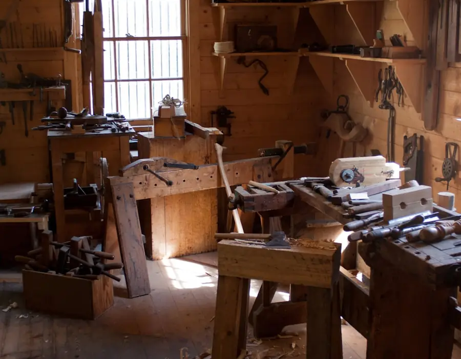

Oswald Condensed / Inter
Condensed capitals and blunt blocks so the trade reads as capable, not decorative.
02 • Independent retail
Marlow & Sons
Concept ProjectGive a small shop the presence of a brand and make browsing on a phone feel considered.
- Target customer
- Local shoppers and visitors who find the shop through Instagram.
- Key conversion journey
- Brand story, product discovery, store information, visit or message
- Visual system
- Warm clay and cream, editorial serif headings, generous product grid
- Selected components
- Editorial product gridOpening hours panelInstagram feed stripStore visit card
Design decisions
- Products are grouped by feel rather than category so browsing stays enjoyable.
- The grid breaks its rhythm every few rows to keep the page from reading like a catalogue.
- Store details sit high on mobile because most visits start with opening hours.
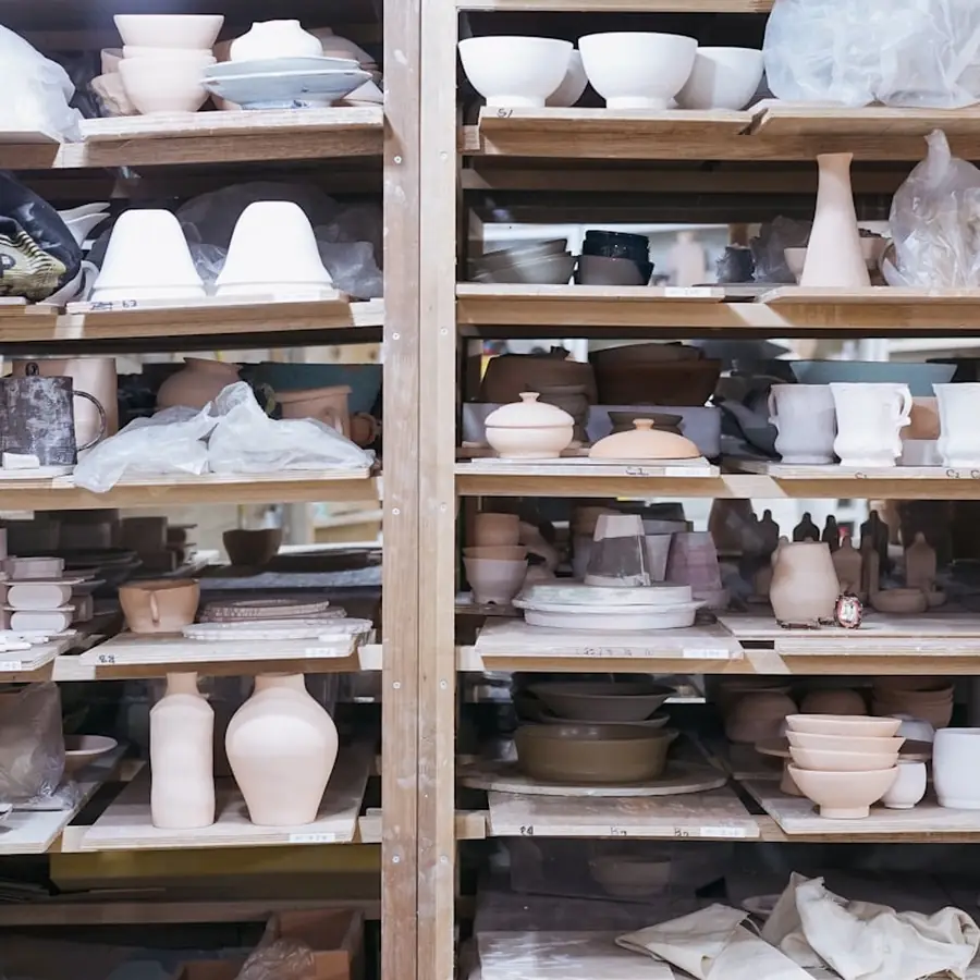


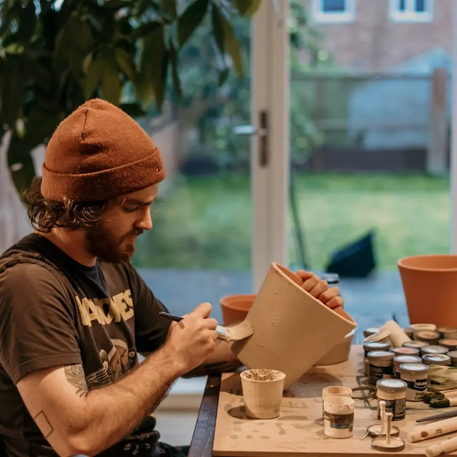
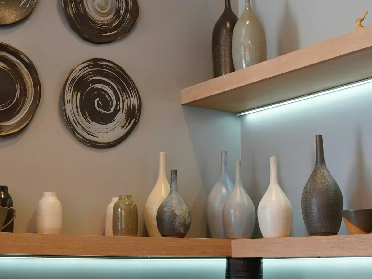
Playfair Display / Inter
Editorial serif and a broken grid so browsing feels curated rather than catalogued.
03 • Clinic or consultant
Seabrook Physiotherapy
Concept ProjectBuild trust quickly and remove friction from the first appointment enquiry.
- Target customer
- Patients comparing two or three local clinics before booking.
- Key conversion journey
- Reassurance, treatment explanation, practitioner credibility, enquiry
- Visual system
- Cool clinical neutrals, calm spacing, plain language service list
- Selected components
- Treatment explainer listPractitioner panelWhat to expect timelineAppointment enquiry form
Design decisions
- Line lengths are kept short so patients reading on a phone are not overwhelmed.
- Every treatment has a plain explanation rather than a clinical label on its own.
- Contrast is raised across the page to keep the site comfortable for older visitors.


Instrument Sans / Inter
Short measure, hairline rules and high contrast so patients can read it calmly.
04 • Hospitality
The Anchor Room
Concept ProjectCarry the atmosphere of the room onto the screen and make booking effortless.
- Target customer
- Locals and visitors deciding where to eat tonight, usually on a phone.
- Key conversion journey
- Atmosphere, menu, opening times, booking or enquiry
- Visual system
- Deep ink with amber light, tall image crops, confident menu typography
- Selected components
- Full bleed atmosphere headerMenu sectionsOpening times cardBooking enquiry
Design decisions
- The menu is real content on the page rather than a downloadable file.
- Booking sits in the header and the footer because it is the only action that matters.
- Image crops are tall so the room fills a phone screen properly.
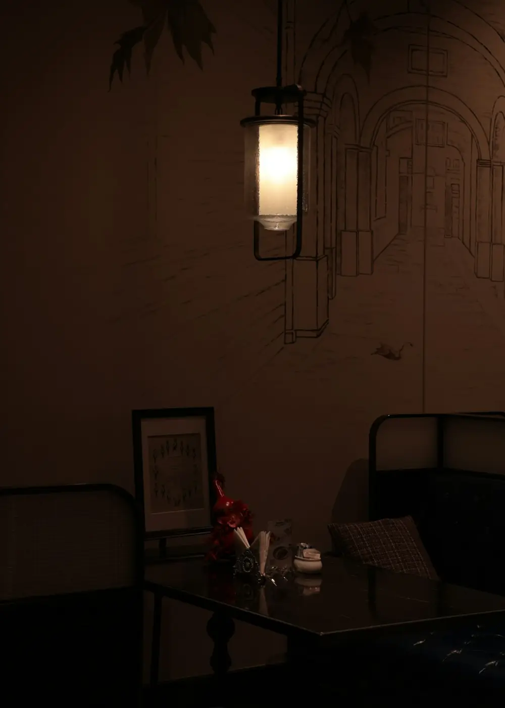
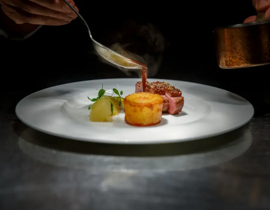
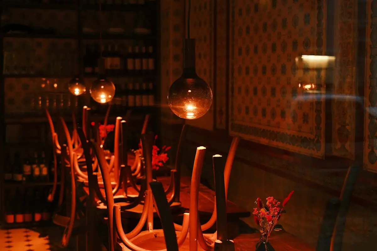
Playfair Display / Inter
Candle amber on deep ink, with the menu typeset as real content rather than a PDF.
05 • Local service business
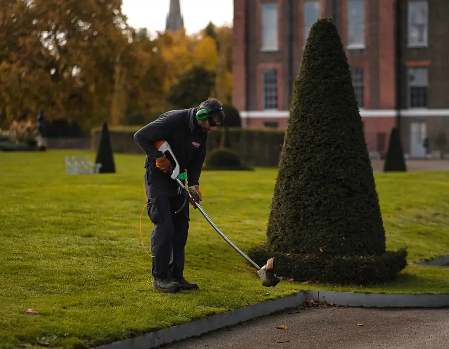
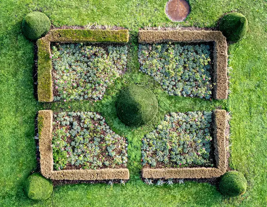
Rowan Grounds Care
Concept ProjectTurn a social media only presence into a simple, credible enquiry route.
- Target customer
- Homeowners and property managers arranging regular maintenance.
- Key conversion journey
- Service list, coverage, seasonal work, callback request
- Visual system
- Fresh neutral base, single strong accent, plain service cards
- Selected components
- Service and pricing guideSeasonal scheduleCoverage listCallback request
Design decisions
- A guide price range is shown so enquiries arrive better qualified.
- The seasonal schedule replaces a blog that would never be updated.
- The form asks for the property type first, which is the detail that decides the quote.


Instrument Sans / Inter
Guide prices and a seasonal strip so enquiries arrive already qualified.
Want to see a direction for your own business?
Tell us what you do and what the website needs to achieve. We will come back with a clear next step.
Start a Project